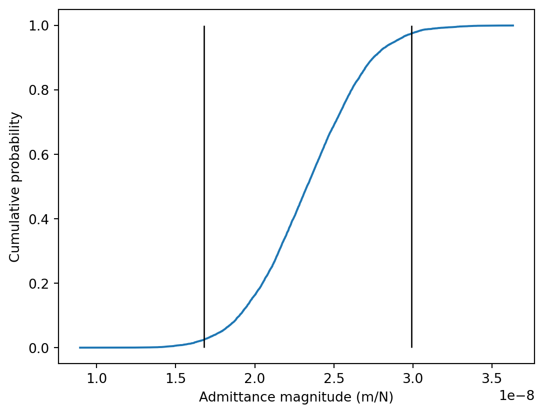
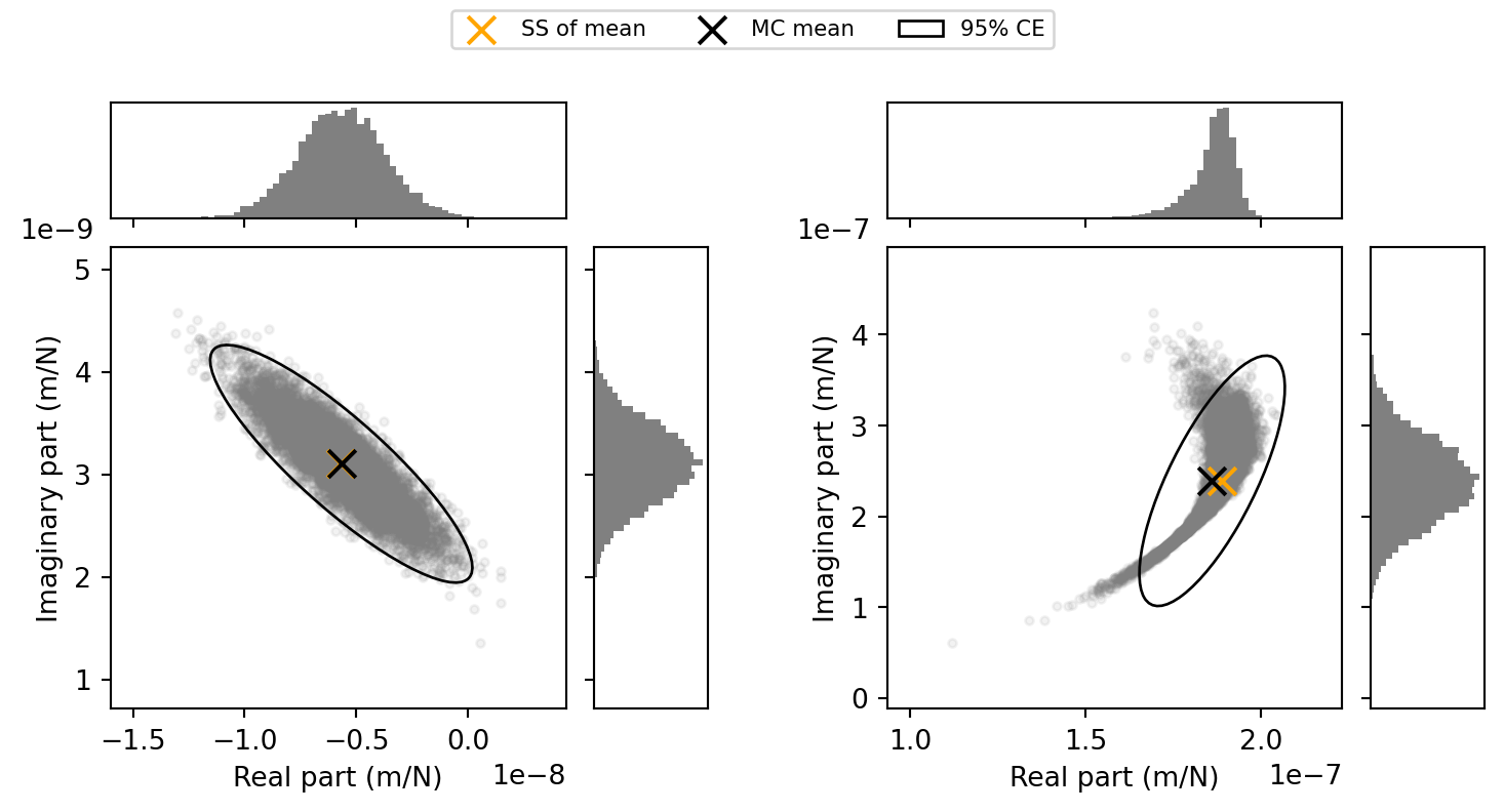
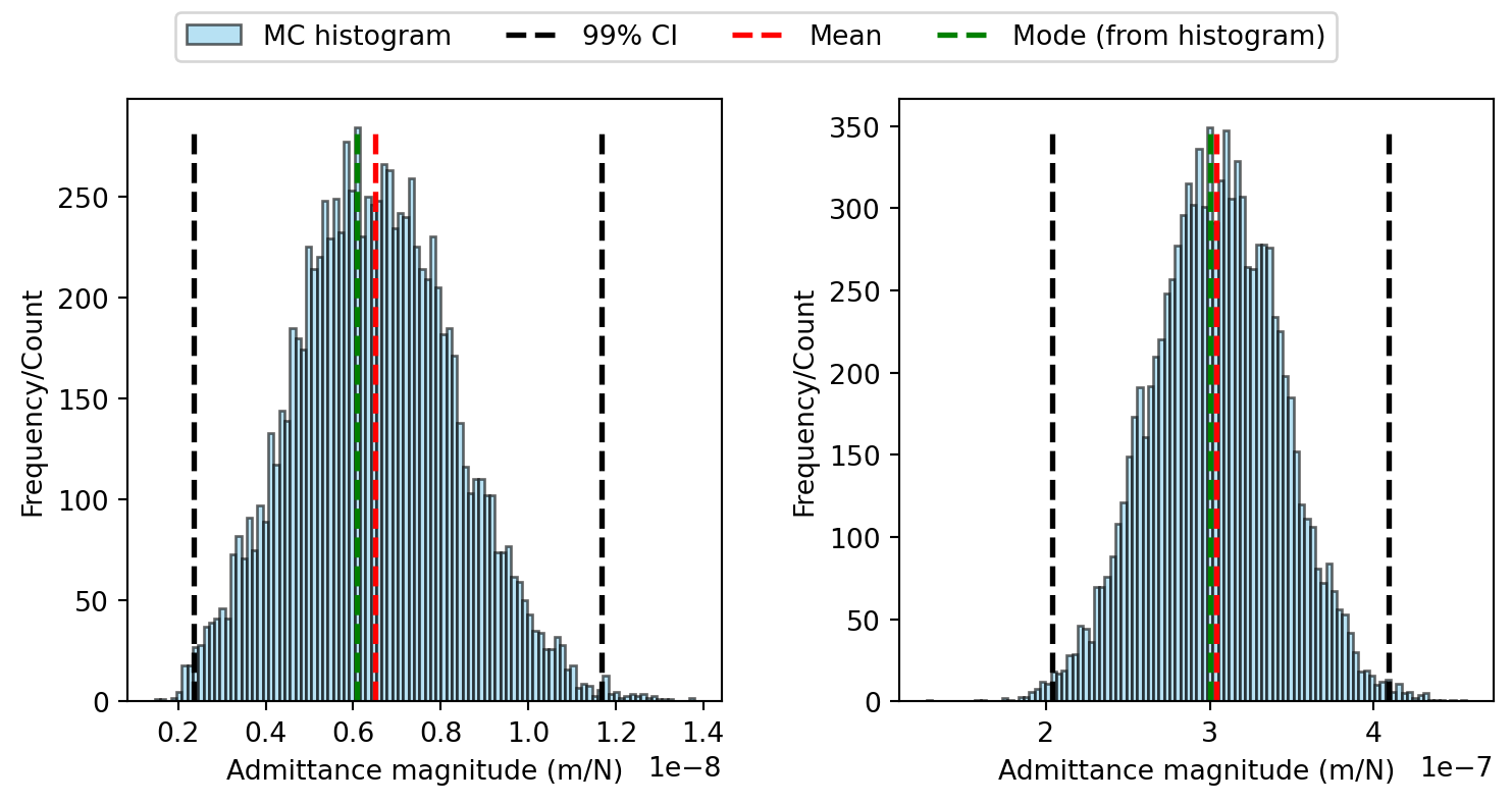
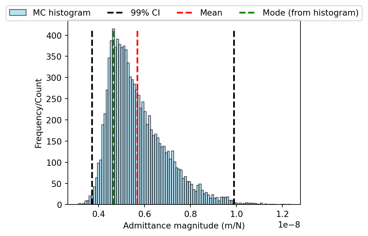
Uncertainty propagation using Monte Carlo simulation: a substructuring example

In this tutorial we will consider the propagation of uncertainty using a Monte-Carlo (MC) simulation approach. We will apply this method to the problem of uncertain joint dynamics in substructuring using the same numerical mass-spring system as in previous tutorials; depicted in Figure 1.

The system is comprised of two components; \(A\) in green, and \(B\) in blue. These components are characterised by their free-interface FRFs \(\mathbf{Y}_A\in\mathbb{C}^{5\times 5}\) and \(\mathbf{Y}_B\in\mathbb{C}^{6\times 6}\), respectively. \(A\) and \(B\) are coupled at three DoFs by a joint with uncertainty stiffness and damping parameters. The aim is to find the uncertainty in the coupled assembly FRFs \(\mathbf{Y}_C\in\mathbb{C}^{11\times 11}\), given the uncertainty in the joint parameters.

Figure 1: Numerical mass-spring assembly used for substructuring example. Component \(A\) in green and \(B\) in blue.

As a reminder, the dual substructuring relation is given by, \[ \mathbf{Y}_C = \mathbf{Y} -\mathbf{Y}\mathbf{B}^{\rm T}\left(\mathbf{B}\mathbf{Y}\mathbf{B}^{\rm T} + \boldsymbol{\Gamma}\right)^{-1}\mathbf{B}\mathbf{Y}. \tag{1}\] where \(\mathbf{Y}\) is a block diagonal matrix of uncoupled (free-interface) component FRF matrices, \(\mathbf{B}\) is a \(signed\) Boolean matrix that enforces continuity between connected DoFs, and \(\boldsymbol{\Gamma}\) is matrix describing the interface flexibility. In the case of rigid coupling, \(\boldsymbol{\Gamma}=\mathbf{0}\). In the case of resilient coupling, \(\boldsymbol{\Gamma}\) is the inverse of the joint impedance, \[ \boldsymbol{\Gamma} = \left[\begin{array}{ccc}Z_1 & &\\ & Z_2 & \\ & & Z_3\end{array}\right]^{-1} \qquad \text{with}\qquad Z_j = k_j + i c_j \]

In this tutorial we will assume that the joint parameters \(k_j\) and \(c_j\) are uncertain (normally distribute with known mean and covariance), and we will use a Monte-Carlo simulation to propagate this uncertainty through the dual substructuring relation to find the uncertainty in the coupled assembly FRF \(\mathbf{Y}_C\).

Monte Carlo simulation

Using a Monte-Carlo approach, we estimate the probability density function (PDF) of function’s output \(\mathbf{y} = G(\mathbf{x})\) by randomly sampling the distribution of the input \(\mathbf{x}\). Failing an analytical solution for the PDF of the output, which is rarely available for problems of realistic complexity, Monte-Carlo simulation is the most robust approach for the propagation of uncertainty; it is frequently used to provide ground truth estimates for the evaluation of alternative methods. By evaluating the function \(G(\square)\) directly, we implicitly capture the effects of non-linearity and their influence on the output distribution. The main limitation of a MC simulation is simply the computation effort required, which can be great for high dimensional problems or expensive models.

A typical Monte-Carlo procedure is as follows:

  1. A random sample \(\mathbf{x}_i\) is drawn from the input distribution, for example the multi-dimensional Normal with mean \(\mu_\mathbf{x}\) and covariance \(\Sigma_{\mathbf{x}}\), \[ \mathbf{x}_i\sim \mathcal{N}(\mu_\mathbf{x},\Sigma_\mathbf{x}) \]
  2. The drawn sample is used to evaluate the function \(G(\square)\) (e.g. our substructuring function), resulting in the output sample \(\mathbf{y}_i\). \[ \mathbf{y}_i = G(\mathbf{x}_i) \] Note that \(G(\square)\) may have other deterministic inputs, for example the free-interface FRFs in our substructuring problem. Being deterministic, these inputs are not sampled and are omitted in the above for brevity.
  3. Steps 1 and 2 are repeated until \(N_{MC}\) output samples are obtained. Collectively, these samples approximate the PDF of the output \(\mathbf{y}\). They can be used to infer any statistics of interest, for example the mean and covariance, \[ \mu_\mathbf{y} = \frac{1}{N_{MC}}\sum_{i=1}^{N_{MC}} \mathbf{y}_i\qquad \qquad \Sigma_\mathbf{y} = \frac{1}{N_{MC}-1}\sum_{i=1}^{N_{MC}} (\mathbf{y}_i - \mu_\mathbf{y})(\mathbf{y}_i - \mu_\mathbf{y})^{\rm T} \]

To avoid unnecessary function evaluations, stopping criteria can be incorporated into the above by using a recursive calculation of, for example, the mean/or covariance.

Define component matrices

To set the problem up we are going to use the same component matrices as from the previous substructuring tutorial.

Define component matrices
import numpy as np
np.random.seed(0)
np.set_printoptions(linewidth=100)
import matplotlib.pyplot as plt
import scipy as sp
from scipy.stats import multivariate_normal
from matplotlib.patches import Ellipse
import matplotlib.transforms as transforms

# Define component masses and build matrices
m1, m2, m3, m4, m5 = 1, 2, 2, 1, 0.5
m6, m7, m8, m9, m10, m11 = 0.5, 2, 1, 3, 5,0.5
M_A = np.diag(np.array([m1,m2,m3,m4,m5])) # Comp A
M_B = np.diag(np.array([m6,m7,m8,m9,m10,m11])) # Comp B

# Define component stiffnesses and build matrices (complex stiffness -> structural damping)
η = 0.05 # Structural loss factor
k1, k2, k3, k4, k5 = 1e5*(1+1j*η), 1.5e5*(1+1j*η), 0.7e5*(1+1j*η), 1e5*(1+1j*η), 0.5e5*(1+1j*η)
k6, k7, k8, k9, k10, k11 = 0.5e5*(1+1j*η), 2e5*(1+1j*η), 1e5*(1+1j*η), 0.2e5*(1+1j*η), 1e5*(1+1j*η),0.5e5*(1+1j*η)
K_A = np.array([[k1+k2+k5, -k2,        0,   0, -k5],
                [-k2,       k2+k3+k4, -k3, -k4, 0],
                [0,        -k3,        k3,  0,  0],
                [0,        -k4,        0,   k4, 0],
                [-k5,       0,         0,   0,  k5]])
K_B =  np.array([[k6,  0,   0,  -k6,     0,          0],
                 [0,   k7,  0,   0,     -k7,         0],
                 [0,   0,   k8,  0,     -k8,         0],
                 [-k6, 0,   0,   k6+k9,  0,         -k9],
                 [0,  -k7, -k8,  0,      k7+k8+k10, -k10],
                 [0,   0,   0,  -k9,    -k10,        k9+k10+k11]])

Nf = 200 # Number of frequency points
f = np.linspace(0,100, Nf) # Generate frequency array
ω = 2*np.pi*f # Convert to radians
Y_A = np.linalg.inv(K_A - np.einsum('i,jk->ijk'**2, M_A))
Y_B = np.linalg.inv(K_B - np.einsum('i,jk->ijk'**2, M_B))

Next we define a few useful functions for plotting the results of the Monte-Carlo simulation.

Some useful plotting functions
def scatter_hist(x, y, ax, ax_histx, ax_histy, nBins):
    # no labels
    ax_histx.tick_params(axis="x", labelbottom=False)
    ax_histy.tick_params(axis="y", labelleft=False)

    # the scatter plot:
    ax.scatter(x, y, marker='.',color='gray',alpha=0.1)
    # ax.scatter(x, y,s = 0.05, marker='.')
    # now determine nice limits by hand:
    binwidth = (np.max(x)-np.min(x))/nBins
    xymax = max(np.abs(x))
    lim = (int(xymax/binwidth) + 1) * binwidth
    bins = np.arange(-lim, lim + binwidth, binwidth)
    ax_histx.hist(x, bins=bins,color='gray')

    binwidth = (np.max(y)-np.min(y))/nBins
    xymax = np.max(np.abs(y))
    lim = (int(xymax/binwidth) + 1) * binwidth
    bins = np.arange(-lim, lim + binwidth, binwidth)
    ax_histy.hist(y, bins=bins, orientation='horizontal',color='gray')


def confidence_ellipse(μ, Σ, ax, n_std=3.0, facecolor='none', **kwargs):
    """
    Create a plot of the covariance confidence ellipse of *x* and *y*.

    Parameters
    ----------
    μ : array-like, shape (2, )
        Input means.

    Σ : array-like, shape (2,2)
        Input covariance.

    ax : matplotlib.axes.Axes
        The Axes object to draw the ellipse into.

    n_std : float
        The number of standard deviations to determine the ellipse's radiuses.

    **kwargs
        Forwarded to `~matplotlib.patches.Ellipse`

    Returns
    -------
    matplotlib.patches.Ellipse
    """

    cov = Σ
    pearson = cov[0, 1]/np.sqrt(cov[0, 0] * cov[1, 1])
    # Using a special case to obtain the eigenvalues of this
    # two-dimensional dataset.
    ell_radius_x = np.sqrt(1 + pearson)
    ell_radius_y = np.sqrt(1 - pearson)
    ellipse = Ellipse((0, 0), width=ell_radius_x * 2, height=ell_radius_y * 2,
                      facecolor='none', **kwargs)

    # Calculating the standard deviation of x from
    # the squareroot of the variance and multiplying
    # with the given number of standard deviations.
    scale_x = np.sqrt(cov[0, 0]) * n_std
    mean_x = μ[0]

    # calculating the standard deviation of y ...
    scale_y = np.sqrt(cov[1, 1]) * n_std
    mean_y = μ[1]

    transf = transforms.Affine2D() \
        .rotate_deg(45) \
        .scale(scale_x, scale_y) \
        .translate(mean_x, mean_y)

    ellipse.set_transform(transf + ax.transData)
    el = ax.add_patch(ellipse)
    el.set_facecolor('none')
    return el

Define uncertainty joint parameters

In this example we will assume that the stiffness and damping parameters of the three joints are normally distributed with a mean vector is given by, \[ \mu_\mathbf{x} = \left(\begin{array}{cccccc} \mu_{k_1} & \mu_{c_1} & \mu_{k_2} & \mu_{c_2} & \mu_{k_3} & \mu_{c_3} \end{array}\right)^{\rm T} = \left(\begin{array}{cccccc} 1e3 & 1 & 2e3 & 2 & 3e3 & 3 \end{array}\right)^{\rm T} \] and a covariance matrix \(\Sigma_\mathbf{x}\) expressed in terms of a correlation matrix and the stiffness/damping standard deviations as so, \[ \Sigma_\mathbf{x} = \left[\begin{array}{cccccc} \sigma_{k_1} & & & & &\\ &\sigma_{c_1} & & & & \\ & & \sigma_{k_2} & & & \\ & & & \sigma_{c_2} & & \\ & & & & \sigma_{k_3} & \\ & & & & & \sigma_{c_3} \end{array}\right] \left[\begin{array}{cccccc} 1& 0.5& & & &\\ 0.5&1& & & & \\ & & 1 &-0.9 & & \\ & & -0.9& 1 & & \\ & & & & 1 & 0 \\ & & & & 0 & 1 \end{array}\right] \left[\begin{array}{cccccc} \sigma_{k_1} & & & & &\\ &\sigma_{c_1} & & & & \\ & & \sigma_{k_2} & & & \\ & & & \sigma_{c_2} & & \\ & & & & \sigma_{k_3} & \\ & & & & & \sigma_{c_3} \end{array}\right]. \] In the examples presented, we set \(\sigma_{k_1}=\sigma_{k_2}=\sigma_{k_3}= \sigma_{k} = 2e2\) and \(\sigma_{c_1}=\sigma_{c_2}=\sigma_{c_3}=\sigma_{c} = 2\times 10^{-1}\).

Note that we have defined the covariance matrix \(\Sigma_\mathbf{x}\) such that the stiffness and damping parameters of each joint are correlated, and that the stiffness parameters of different joints are uncorrelated. This is just an example, and the correlation structure can be defined as desired to reflect the problem at hand.

Define uncertain joint parameters and plot distribution
r2C_ = np.array([1, 1j])
r2C = sp.linalg.block_diag(r2C_, r2C_, r2C_) # Mapping from real to complex vector

# Define mean
kj1, kj2, kj3 = 1*1e3, 2*1e3, 3*1e3
cj1, cj2, cj3 = 1, 2, 3

μD = np.array([kj1, cj1, kj2, cj2, kj3, cj3])
σ = np.array([3e2, 2e-1, 3e2, 2e-1, 3e2, 2e-1])
R = np.array([[1, 0.5,   0, 0, 0, 0],
              [0.5, 1,   0, 0, 0, 0],
              [0, 0, 1, -0.9, 0, 0],
              [0, 0, -0.9, 1, 0, 0],
              [0, 0, 0,  0, 1, 0],
              [0, 0, 0,  0, 0, 1]])
ΣD = np.diag(σ)@ R @ np.diag(σ)

# Plot distribution of uncertain parameters

rv1 = multivariate_normal(μD[0:2], ΣD[0:2,0:2])
rv2 = multivariate_normal(μD[2:4], ΣD[2:4,2:4])
rv3 = multivariate_normal(μD[4:6], ΣD[4:6,4:6])

x = np.linspace(kj1*0.01, kj1*2, 500)
y = np.linspace(cj1*0.5, cj1*1.5, 500)
X, Y = np.meshgrid(x,y)
pos = np.empty(X.shape + (2,))
pos[:, :, 0] = X
pos[:, :, 1] = Y
pd1 = rv1.pdf(pos)
pd2 = rv2.pdf(pos*2)
pd3 = rv3.pdf(pos*3)

fig, axs = plt.subplots(1, 3, figsize=(9, 4))
axs[0].contour(X, Y, pd1/np.max(pd1), levels=np.linspace(0.0005,1,10), cmap='viridis')
axs[0].set_xlabel('Stiffness (m/N)')
axs[0].set_ylabel('Damping (m/Ns)')
axs[0].set_title('Joint 1')
axs[1].contour(X*2, Y*2, pd2/np.max(pd2), levels=np.linspace(0.0005,1,10), cmap='viridis')
axs[1].set_xlabel('Stiffness (m/N)')
axs[1].set_ylabel('Damping (m/Ns)')
axs[1].set_title('Joint 2')
axs[2].contour(X*3, Y*3, pd3/np.max(pd3), levels=np.linspace(0.0005,1,10), cmap='viridis')
axs[2].set_xlabel('Stiffness (m/N)')
axs[2].set_ylabel('Damping (m/Ns)')
axs[2].set_title('Joint 3')
plt.tight_layout()
plt.show()
Figure 2: Contour plot of the probability density function of the uncertain joint parameters.

Run Monte Carlo simulation

We are now ready to run out MC simulation. First we build the block diagonal matrix of uncoupled component FRFs, and then we compute the coupled FRF using the mean joint parameters. It will be interesting to compare the mean of the MC simulation to the substructured result of mean joint parameters.

In Figure 3 we plot the MC samples of the joint parameters as used in the simulation. As expected, we see that they follow the set distributions in Figure 2.

Define uncertain joint parameters and plot distribution
Y = np.zeros((f.shape[0],11,11), dtype='complex') # Allocate space
for fi in range(f.shape[0]): # Build block diagonal (uncoupled) FRF matrix
    Y[fi,:,:] = sp.linalg.block_diag(Y_A[fi,:,:],Y_B[fi,:,:])

# Boolean continuity matrix:
B = np.array([[0,0,1,0,0,-1,0,0,0,0,0],
              [0,0,0,1,0,0,-1,0,0,0,0],
              [0,0,0,0,1,0,0,-1,0,0,0]])

Y_C_dual_μ = np.zeros_like(Y)
for fi in range(f.shape[0]): # Compute coupled FRF using mean joint parameters
    Y_C_dual_μ[fi,:,:] = Y[fi,:,:] - Y[fi,:,:]@B.T@np.linalg.inv(B@Y[fi,:,:]@B.T + np.diag(1/(r2C@μD)))@B@Y[fi,:,:]

N_MC = 10000 # Number of MC simulations
Dj_i = []
Y_C_dual_mc = []
Y_C_dual = np.zeros_like(Y)
for mc in range(N_MC):
    Dj_i.append(np.random.multivariate_normal(μD, ΣD, 1))
    for fi in range(Nf):
        Y_C_dual[fi,:,:] = Y[fi,:,:] - Y[fi,:,:]@B.T@np.linalg.inv(B@Y[fi,:,:]@B.T + np.diag(np.squeeze(1/(r2C@np.asarray(Dj_i[mc]).T))))@B@Y[fi,:,:]
    Y_C_dual_mc.append(Y_C_dual[:,0,-1].copy())

fig, axs = plt.subplots(1, 3, figsize=(9, 4))
axs[0].scatter(np.asarray(Dj_i)[:,0,0], np.asarray(Dj_i)[:,0,1], s=5, marker='.',color='blue',label='MC',alpha=0.1)
axs[0].set_xlabel('Stiffness (m/N)')
axs[0].set_ylabel('Damping (m/Ns)')
axs[0].set_title('Joint 1')
axs[0].set_xlim(kj1*0.01, kj1*2)
axs[0].set_ylim(cj1*0.5, cj1*1.5)
axs[1].scatter(np.asarray(Dj_i)[:,0,2], np.asarray(Dj_i)[:,0,3], s=5, marker='.',color='blue',alpha=0.1)
axs[1].set_xlabel('Stiffness (m/N)')
axs[1].set_ylabel('Damping (m/Ns)')
axs[1].set_title('Joint 2')
axs[1].set_xlim(kj2*0.01, kj2*2)
axs[1].set_ylim(cj2*0.5, cj2*1.5)
axs[2].scatter(np.asarray(Dj_i)[:,0,4], np.asarray(Dj_i)[:,0,5], s=5, marker='.',color='blue',alpha=0.1)
axs[2].set_xlabel('Stiffness (m/N)')
axs[2].set_ylabel('Damping (m/Ns)')
axs[2].set_title('Joint 3')
axs[2].set_xlim(kj3*0.01, kj3*2)
axs[2].set_ylim(cj3*0.5, cj3*1.5)
plt.tight_layout()
plt.show()
Figure 3: MC samples for the joint parameters.

In Figure 4 we plot the MC results for the magnitude of the coupled FRF between DoF 1 and 11. The shaded area indicates the max/min range of MC samples, the dashed orange line is the substructured result made using the mean joint parameters, the dashed black line is the mean of the MC samples and the solid black lines indicate the 95% confidence interval (CI) of the MC samples. Two vertical red lines are also plot; these mark a pair of frequencies that we will examine in more detail shortly.

Estimate the MC 95% confidence interval of the coupled FRF and plot
f1 = np.argmin(np.abs(f-84)) # Frequency index of interest
f2 = np.argmin(np.abs(f-47)) # Frequency index of interest

# Extract MC results:
y = np.abs(np.asarray(Y_C_dual_mc))
y0 = np.real(np.asarray(Y_C_dual_mc))
y1 = np.imag(np.asarray(Y_C_dual_mc))

## Estimation of CI for MC samples
α = 0.05 # Condifence level
CI_MC_f_ = np.zeros((2,Nf)) # Allocate space for confidence intervals
CI_MC_f = np.zeros((2,Nf)) # Allocate space for confidence intervals
for fi in range(Nf):
    X = np.sort(y[:, fi]) # Get magnitude
    F = (np.arange(1, N_MC+1)) / float(N_MC)
    idx1 = (np.abs(F - α/2)).argmin() # Index for -CI
    idx2 = (np.abs(F - (1-α/2))).argmin() # Index for +CI
    CI_MC_f[:,fi] = np.asarray([X[idx1], X[idx2]]) # Group +/-CI

    # lower = np.percentile(y[:, fi], 100*α/2,method="weibull")
    # upper = np.percentile(y[:, fi], 100*(1-α/2),method="weibull")
    # CI_MC_f_[:, fi] = [lower, upper]


fig, axs = plt.subplots(1,figsize=(6.4, 4.8))
axs.fill_between(f, np.max(np.abs(np.asarray(Y_C_dual_mc)),axis=0), np.min(np.abs(np.asarray(Y_C_dual_mc)),axis=0), color='lightgray', label='MC range')
axs.semilogy(f, CI_MC_f[0,:], color='black',linestyle='solid', linewidth=1)
axs.semilogy(f, CI_MC_f[1,:], label='95% CI',color='black',linestyle='solid', linewidth=1)
axs.semilogy(f, np.mean(np.abs(np.asarray(Y_C_dual_mc)),axis=0), label='MC mean',color='black')
axs.semilogy(f, np.abs(np.asarray(Y_C_dual_μ[:,0,-1])), label='SS of mean',color='orange',linestyle='dashed')
axs.vlines(f[f1], 1e-9, 1e-7, color='red', linestyle='dotted', label='f1', linewidth=1)
axs.vlines(f[f2], 1e-8, 1e-6, color='red', linestyle='dashed', label='f2', linewidth=1)
axs.set_xlim(0,100)
axs.set_xlabel('Frequency (Hz)')
axs.set_ylabel('Admittance magnitude (m/N)')
axs.legend(loc='upper center', bbox_to_anchor=(0.5, 1.1),
          fancybox=True, ncol=6)
plt.show()
Figure 4: Contour plot of the probability density function of the uncertain joint parameters.

To etimate the 95% confidence interval (CI) of the MC samples (magnitude), we sort the samples at each frequency and find the values at the 2.5 and 97.5 percentiles; these values are then used as the lower and upper bounds of the CI, respectively. This approach is non-parametric and makes no assumptions on the distribution of the MC samples.

Empirical cummulative density plot of the coupled FRF magnitude at an arbitary
fig, axs = plt.subplots(1,figsize=(6.4, 4.8))
plt.plot(X,F)
axs.vlines(CI_MC_f[:,-1],0,1, color='black',linestyle='solid', linewidth=1,label='95% CI_sorted')
plt.xlabel("Admittance magnitude (m/N)")
plt.ylabel("Cumulative probability")
plt.show()
Figure 5: Empirical cumulative density plot of the coupled FRF magnitude at an arbitrary frequency with 95% CI interval marked.

Examine specific frequencies

Lets look in a bit more detail at whats going on at the two frequencies illustrated in Figure 4.

In Figure 6 we plot the real and imaginary parts of the MC samples at these frequencies as a bivariate histogram, with the mean and confidence ellipses indicated. Note that the mean plot in black shows the mean of the MC samples, which the marker in orange is the substructured result using the mean of the joint distribution.

An imiediate observation is that whilst the distirbution of the samples at 84 Hz is relatively Normal, the distribution at 47 Hz is highly non-normal. This is due to the non-linearity of the substructuring function, which has a greater influence on the output distribution at 47 Hz than at 84 Hz. This highlights one of the key advantages of a MC simulation; by evaluating the function directly we capture the effects of non-linearity on the output distribution, which can be significant in many problems of interest.

A second point of interest is that the mean of the MC samples is not exactly the same as the substructured result using the mean of the joint distribution, particularly at 47 Hz. This is again due to the non-linearity of the substructuring function, specifically a phenomenon known as non-linear bias.

To unserstand the cause of this bias, recall that a non-linear function \(G(\mathbf{x}_0+\boldsymbol{\Delta})\), whose input is perturbed by vector \(\boldsymbol{\Delta}\), can be expressed as a Taylor series about \(\mathbf{x}_0\) in the following form, \[ \begin{align} \mathbf{y} &= G(\mathbf{x}_0 + \boldsymbol{\Delta})\\ &= G(\mathbf{x}_0) + \mathbf{D}_{\Delta } G + \frac{ \mathbf{D}^2_{\Delta } G}{2!} + \frac{ \mathbf{D}^3_{\Delta } G}{3!} + \frac{ \mathbf{D}^4_{\Delta } G}{4!} \cdots \end{align} \] where \(\mathbf{D}^i_{\Delta} G\) denotes the total differential of \(G(\mathbf{x})\) when perturbed around \(\mathbf{x}_0\) by \(\boldsymbol{\Delta}\). The \(i\)th term in the above Taylor series is given by, \[ \frac{ \mathbf{D}^i_{\Delta} G}{i!} = \frac{1}{i!} \left(\sum_{j=1}^N {\Delta_j} \frac{\partial }{\partial x_j} \right)^i G(\mathbf{x}_0)\Bigg |_{\mathbf{x}=\mathbf{x}_0} \] with \({\Delta_j}\) denoting the \(j\)th element of the perturbation vector \(\boldsymbol{\Delta}\).

If we assume that the perturbation \(\boldsymbol{\Delta}\) is zero mean, and take the expectation of the Taylor series expansion, we have, \[ \mathbf{y} \approx G(\mathbf{x}_0) + \mathbf{D}_{\Delta } G(\mathbf{x}_0) + \frac{\mathbf{D}^2_{\Delta }G(\mathbf{x}_0)}{2} +\cdots \quad \longrightarrow \quad \mu_\mathbf{y} = G(\mu_\mathbf{x}) + \frac{\mathbf{D}^2_{\Delta }G(\mu_{\mathbf{x}})}{2} + G(\mu_\mathbf{x}) + \frac{\mathbf{D}^4_{\Delta }G(\mu_{\mathbf{x}})}{4!} \cdots \] since odd powers of \(\boldsymbol{\Delta}\) have a zero expectation and even powers of \(\boldsymbol{\Delta}\) have a non‑zero expectation.

Clearly, by making a prediction using only the mean value (i.e. the first term in the Taylor series), we are omitting the higher order terms; this leaves us with a bias error whenever the underlying equation is non-linear, as in Figure 6 b).

Code
###### Frequency 1 ########

μY_real = np.mean(y0[:,f1])
μY_imag = np.mean(y1[:,f1])
ΣY = np.cov(np.stack((y0[:,f1], y1[:,f1])))

import matplotlib.gridspec as gridspec

# Generate plot
# fig = plt.figure(figsize=(5, 5))
fig = plt.figure(figsize=(9, 4))
outer = gridspec.GridSpec(1, 2, wspace=0.3)

gs1 = gridspec.GridSpecFromSubplotSpec(2, 2, width_ratios=(4, 1), height_ratios=(1, 4), subplot_spec=outer[0], wspace=0.1, hspace=0.1)

ax = fig.add_subplot(gs1[1, 0])
ax_histx = fig.add_subplot(gs1[0, 0], sharex=ax)
ax_histy = fig.add_subplot(gs1[1, 1], sharey=ax)
ax_histy.set_xticks([])
ax_histx.set_yticks([])
scatter_hist(y0[:,f1], y1[:,f1], ax, ax_histx, ax_histy, 50)
ax.scatter(np.real(Y_C_dual_μ[f1, 0, -1]), np.imag(Y_C_dual_μ[f1, 0, -1]), s=100,marker='x',color='orange',label='SS of mean')
ax.scatter(μY_real, μY_imag, s=100, marker='x',color='black',label='MC mean')
ax.set_xlabel('Real part (m/N)')
ax.set_ylabel('Imaginary part (m/N)')

Δx = 0.2
Δy = 0.2
ax.set_xlim(np.min(y0[:,f1])-Δx*np.abs(np.max(y0[:,f1])-np.min(y0[:,f1])), np.max(y0[:,f1])+Δx*np.abs(np.max(y0[:,f1])-np.min(y0[:,f1])))
ax.set_ylim(np.min(y1[:,f1])-Δy*np.abs(np.max(y1[:,f1])-np.min(y1[:,f1])), np.max(y1[:,f1])+Δy*np.abs(np.max(y1[:,f1])-np.min(y1[:,f1])))

ax.ticklabel_format(axis='both',style='scientific',scilimits=(0,0))
t = ax.yaxis.get_offset_text()
t.set_x(-0.2)

ell1 = confidence_ellipse([μY_real, μY_imag], ΣY, ax, n_std=3.0, edgecolor='black', linestyle='solid',label='95% CE')

###### Frequency 2 ########

μY_real = np.mean(y0[:,f2])
μY_imag = np.mean(y1[:,f2])
ΣY = np.cov(np.stack((y0[:,f2], y1[:,f2])))

# Generate plot
gs2 = gridspec.GridSpecFromSubplotSpec(2, 2, width_ratios=(4, 1), height_ratios=(1, 4), subplot_spec=outer[1], wspace=0.1, hspace=0.1)

ax = fig.add_subplot(gs2[1, 0])
ax_histx = fig.add_subplot(gs2[0, 0], sharex=ax)
ax_histy = fig.add_subplot(gs2[1, 1], sharey=ax)
ax_histy.set_xticks([])
ax_histx.set_yticks([])
scatter_hist(y0[:,f2], y1[:,f2], ax, ax_histx, ax_histy, 50)
ax.scatter(np.real(Y_C_dual_μ[f2, 0, -1]), np.imag(Y_C_dual_μ[f2, 0, -1]), s=100,marker='x',color='orange',label='SS of mean')
ax.scatter(μY_real, μY_imag, s=100, marker='x',color='black',label='MC mean')
ax.set_xlabel('Real part (m/N)')
ax.set_ylabel('Imaginary part (m/N)')

Δx = 0.2
Δy = 0.2
ax.set_xlim(np.min(y0[:,f2])-Δx*np.abs(np.max(y0[:,f2])-np.min(y0[:,f2])), np.max(y0[:,f2])+Δx*np.abs(np.max(y0[:,f2])-np.min(y0[:,f2])))
ax.set_ylim(np.min(y1[:,f2])-Δy*np.abs(np.max(y1[:,f2])-np.min(y1[:,f2])), np.max(y1[:,f2])+Δy*np.abs(np.max(y1[:,f2])-np.min(y1[:,f2])))

ax.ticklabel_format(axis='both',style='scientific',scilimits=(0,0))
t = ax.yaxis.get_offset_text()
t.set_x(-0.2)

ell1 = confidence_ellipse([μY_real, μY_imag], ΣY, ax, n_std=3.0, edgecolor='black', linestyle='solid',label='95% CE')
handles, labels = ax.get_legend_handles_labels()

fig.legend(handles, labels, loc='upper center',ncol=3,fontsize=8)

plt.show()
Figure 6: Bivariate histogram of real/imaginary parts of MC samples at frequencies f1 (left) and f2 (right), with mean and confidence ellipses indicated.

Lastly, in Figure 7 we plot the histogram of the magnitude of the MC samples at these frequencies. We also mark the correponding 95% CI, mean and mode.

It is worth noting that, since the magnitude is strictly positive, its distribution does not support negative values and is therefore non-normal, and often highly skewed. An important consequence of this is that the mean and mode of the distribution can be quite different. Typically, we do not think about the mode, but in some cases it can be a more meaningful statistic to report than the mean; it represents the most likely value in the distibution. In Figure 7 we see a slight skew at 47 Hz, though perhaps not enough to justify the use of the mode.

Code
# Create histogram and capture counts + bin edges
counts, bin_edges = np.histogram(y[:, f1], bins=100)
max_bin_index = np.argmax(counts)
mode_from_hist = (bin_edges[max_bin_index] + bin_edges[max_bin_index + 1])/2
mean = np.mean(y[:, f1])

α = 0.01 # Condifence level
X = np.sort(y[:, f1]) # Get magnitude
F = np.linspace(0, 1, N_MC)
idx1 = (np.abs(F - α/2)).argmin() # Index for -CI
idx2 = (np.abs(F - (1-α/2))).argmin() # Index for +CI
CI_MC = np.asarray([X[idx1], X[idx2]]) # Group +/-CI


# Plot histogram
fig = plt.figure(figsize=(9, 4))
outer = gridspec.GridSpec(1, 2, wspace=0.3)
axs = fig.add_subplot(outer[0])

axs.hist(y[:, f1], bins=100, alpha=0.6, color='skyblue', edgecolor='black', density=False, label='MC histogram')
axs.vlines(CI_MC, 0, counts[max_bin_index], color='black',linestyle='dashed', linewidth=2, label="99% CI")
axs.vlines(mean, 0, counts[max_bin_index],color='red', linestyle='dashed', linewidth=2, label="Mean")
axs.vlines(mode_from_hist, 0, counts[max_bin_index], color='green', linestyle='dashed', linewidth=2,
            label="Mode (from histogram)")
axs.set_xlabel("Admittance magnitude (m/N)")
axs.set_ylabel("Frequency/Count")

# Create histogram and capture counts + bin edges
counts, bin_edges = np.histogram(y[:, f2], bins=100)
max_bin_index = np.argmax(counts)
mode_from_hist = (bin_edges[max_bin_index] + bin_edges[max_bin_index + 1])/2
mean = np.mean(y[:, f2])

α = 0.01 # Condifence level
X = np.sort(y[:, f2]) # Get magnitude
F = np.array(range(N_MC))/float(N_MC)
idx1 = (np.abs(F - α/2)).argmin() # Index for -CI
idx2 = (np.abs(F - (1-α/2))).argmin() # Index for +CI
CI_MC = np.asarray([X[idx1], X[idx2]]) # Group +/-CI

# Plot histogram
axs = fig.add_subplot(outer[1])
axs.hist(y[:, f2], bins=100, alpha=0.6, color='skyblue', edgecolor='black', density=False, label='MC histogram')
axs.vlines(CI_MC, 0, counts[max_bin_index], color='black',linestyle='dashed', linewidth=2, label="99% CI")
axs.vlines(mean, 0, counts[max_bin_index],color='red', linestyle='dashed', linewidth=2, label="Mean")
axs.vlines(mode_from_hist, 0, counts[max_bin_index], color='green', linestyle='dashed', linewidth=2,
            label="Mode (from histogram)")
axs.set_xlabel("Admittance magnitude (m/N)")
axs.set_ylabel("Frequency/Count")

handles, labels = axs.get_legend_handles_labels()
fig.legend(handles, labels, loc='upper center',fancybox=True, ncol=4)

plt.show()
Figure 7: Histogram of MC samples at frequencies f1 (left) and f2 (right), with mean, mode and confidence intervals indicated.

In Figure 8 we plot the histogram of the MC samples at a frequency that displays strong skewness. In this case, the mean and mode are quite different. Which statistic is more meaningful to report in this case depends on the context and the specific question being asked.

Code
# f3 = np.argmin(np.abs(f-42.5)) # Frequency index of interest
f3 = np.argmin(np.abs(f-78)) # Frequency index of interest

# Create histogram and capture counts + bin edges
counts, bin_edges = np.histogram(y[:, f3], bins=100)
max_bin_index = np.argmax(counts)
mode_from_hist = (bin_edges[max_bin_index] + bin_edges[max_bin_index + 1])/2
mean = np.mean(y[:, f3])

α = 0.01 # Condifence level
X = np.sort(y[:, f3]) # Get magnitude
F = np.array(range(N_MC))/float(N_MC)
idx1 = (np.abs(F - α/2)).argmin() # Index for -CI
idx2 = (np.abs(F - (1-α/2))).argmin() # Index for +CI
CI_MC = np.asarray([X[idx1], X[idx2]]) # Group +/-CI

# Plot histogram
fig, axs = plt.subplots(1,figsize=(5, 4))
axs.hist(y[:, f3], bins=100, alpha=0.6, color='skyblue', edgecolor='black', density=False, label='MC histogram')
axs.vlines(CI_MC, 0, counts[max_bin_index], color='black',linestyle='dashed', linewidth=2, label="99% CI")
axs.vlines(mean, 0, counts[max_bin_index],color='red', linestyle='dashed', linewidth=2, label="Mean")
axs.vlines(mode_from_hist, 0, counts[max_bin_index], color='green', linestyle='dashed', linewidth=2,
            label="Mode (from histogram)")
axs.set_xlabel("Admittance magnitude (m/N)")
axs.set_ylabel("Frequency/Count")
axs.legend(loc='upper center', bbox_to_anchor=(0.5, 1.1),
          fancybox=True, ncol=4)
plt.show()
Figure 8: Histogram of MC samples at frequency of 78 Hz displaying strong skewness, with mean, mode and confidence intervals indicated.

Summary

In this tutorial we have seen how to run a simple MC simulation to propagate uncertainty through a substructuring problem. We have also seen how to estimate the confidence interval of the MC samples, and how to visualise the distribution of the samples at specific frequencies of interest.

The key advantage of a MC simulation is that it captures the effects of non-linearity on the output distribution, which can be significant in many problems of interest. However, this comes at the cost of increased computational expense, and the need to run a large number of simulations to obtain accurate estimates of the output distribution. Alternative methods are available (such as linearisation, see Uncertainty in VAVPs), though they come at the cost of accuracy, espeically for mid-high levels of uncertainty.